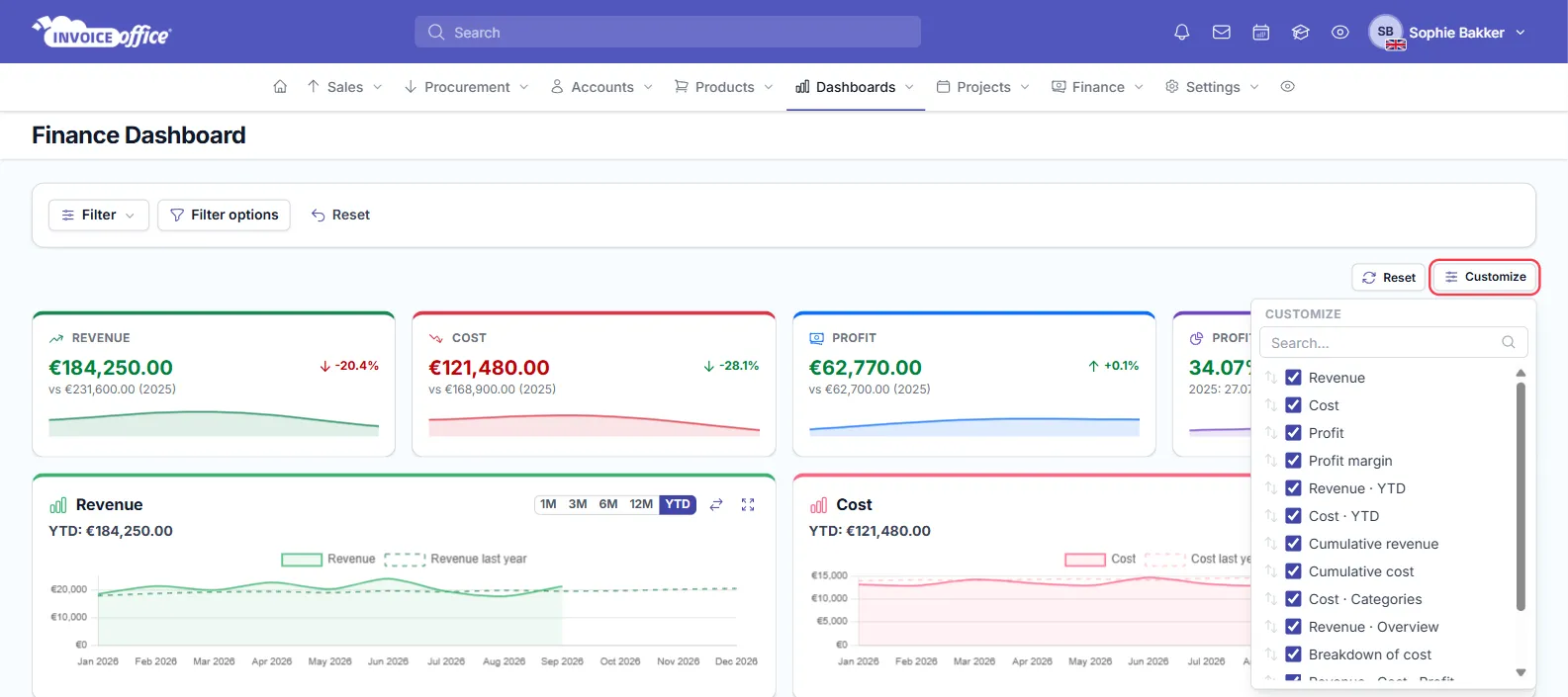
The finance dashboard in Invoice Office is your revenue overview on one page: four tiles with your Revenue, Cost, Profit and Profit margin, compared with the two previous years, and a board of charts that break those numbers down month by month. The figures come from your ledger; the tiles use the same calculation as the Profit and loss report, so they match that report and the rest of your financial reporting.
What counts towards the numbers
- Revenue is the total of your revenue ledger accounts, and Cost the total of your cost ledger accounts.
- Invoices, credit notes and expenses are posted to the ledger when you finalize them. Draft documents are not counted — so if a new expense is missing from Cost, check that it has been finalized.
- Profit is Revenue minus Cost. When it is negative, the tile is called Loss and shows in red.
Step 1 — Open the finance dashboard
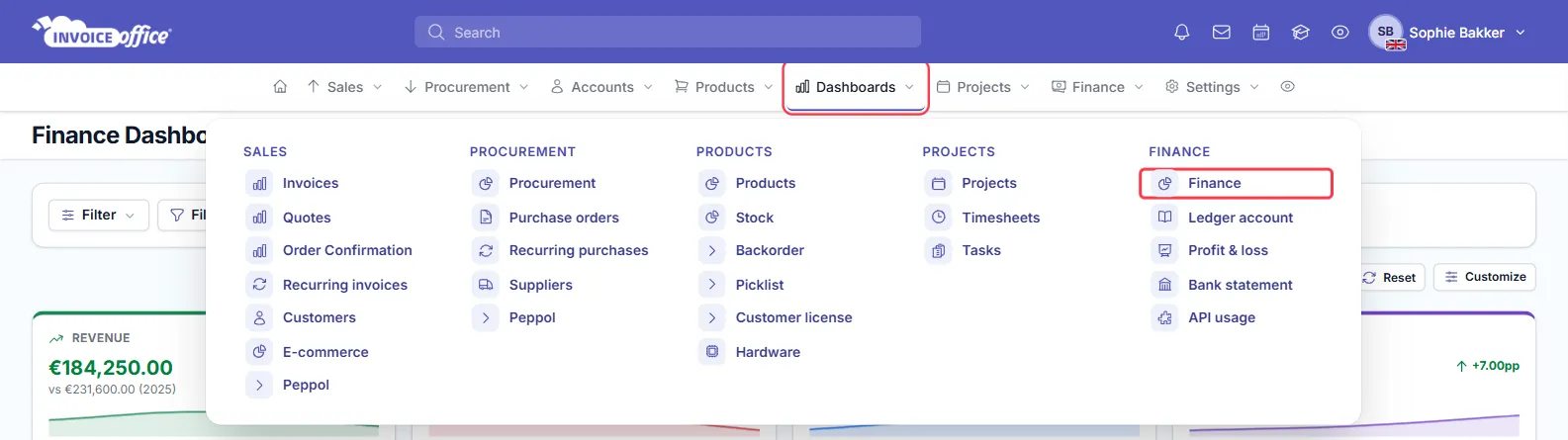
Go to Dashboards and, in the Finance column, choose Finance.
You need permission to view both reports and finance to see this page. If you get a no-access message when you open it, ask an administrator to check your role — see how to manage user roles and permissions.
Step 2 — Read the summary tiles
The four tiles at the top show the selected period — by default the current year up to today:
- Revenue, Cost and Profit: the amount, the total for the whole of last year underneath (“vs … (2025)”) and the change in %. A small line shows the two previous years and the current period.
- Profit margin: profit as a percentage of revenue, the margins of the two previous years underneath, and the change in percentage points (pp).
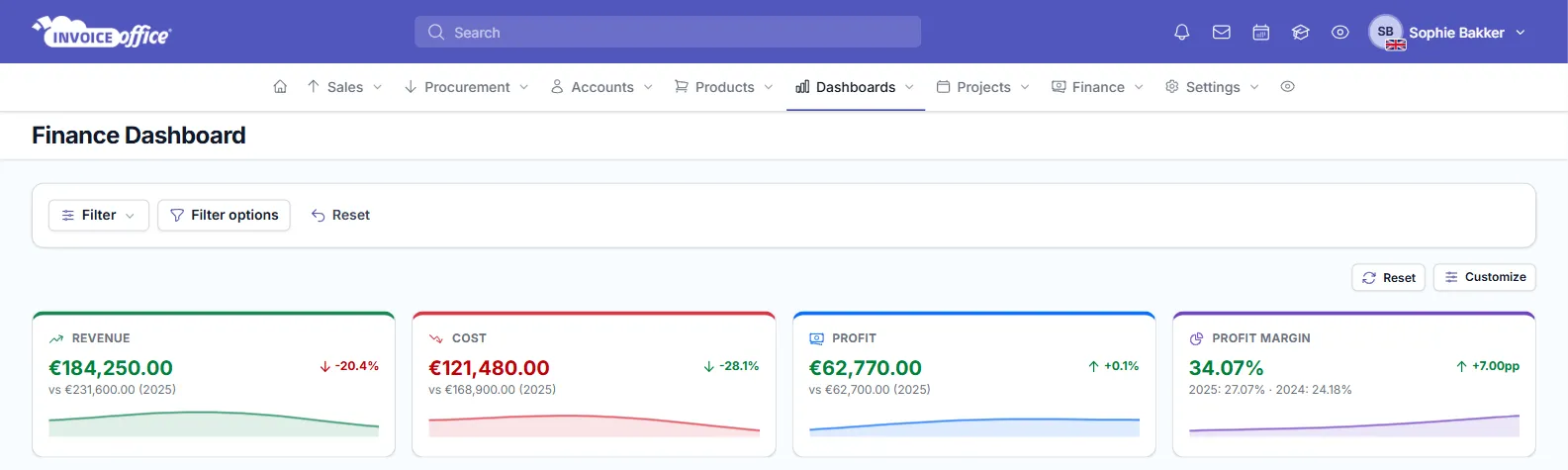
The comparison is always against the full previous calendar year. Early in the year, a lower figure than last year is expected — last year’s total covers twelve months.
Step 3 — Filter by date range
Use the filter bar above the tiles:
-
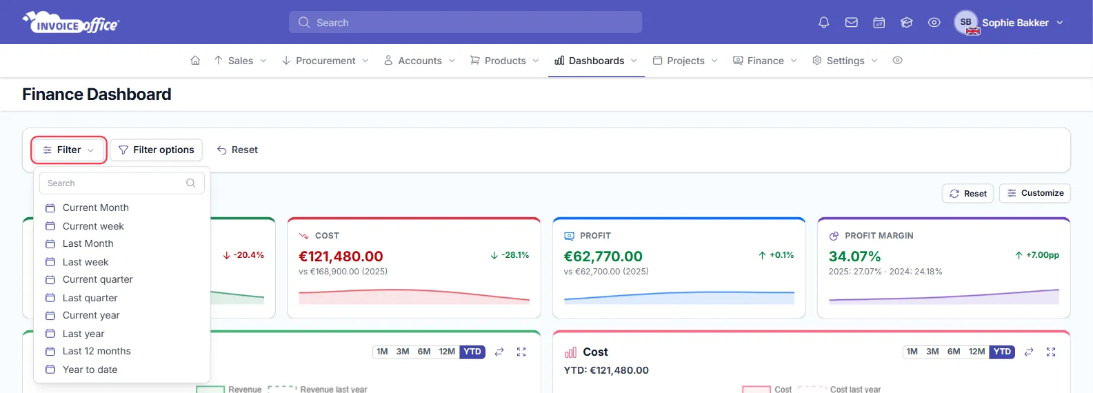
Open Filter and pick a period: Current Month, Current week, Last Month, Last week, Current quarter, Last quarter, Current year, Last year, Last 12 months or Year to date.
-
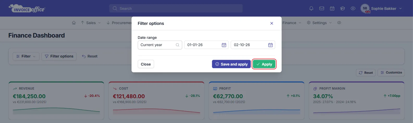
For your own dates, click Filter options. Under Date range, pick a preset or fill in the start and end date, then click Apply.
-
To keep the date range, click Save and apply instead, give the filter a name and click Save and apply again. It then appears in the Filter list, so you can switch back to it in one click.
-
Reset returns to the default period.
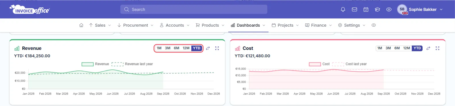
The date range drives the four tiles and most charts. The Revenue, Cost, Cumulative revenue and Cumulative cost charts have their own period buttons — 1M, 3M, 6M, 12M and YTD — and the arrows icon next to them shows or hides the dashed line for the same period last year.
Step 4 — Look at the charts
Below the tiles, the charts break the totals down:
- Revenue and Cost — totals per month for the chosen window, with the total for that window above the chart (year to date by default). Click the chart title to open the Profit & loss report.
- Cumulative revenue and Cumulative cost — the running total for the chosen window against the same window a year earlier.
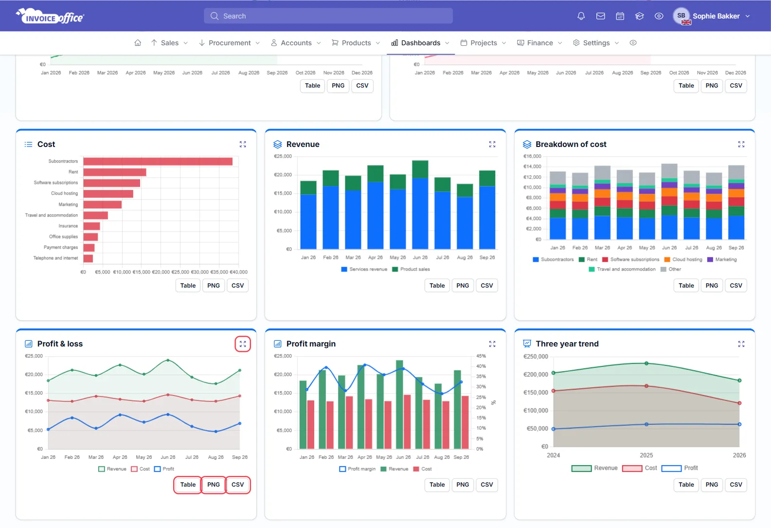
- Your cost per category, a monthly revenue overview and a monthly Breakdown of cost.
- Profit & loss, Profit margin and a Three year trend comparing revenue, cost and profit.
Click the expand icon on a chart to open it full size.
Step 5 — See the figures behind a chart or export them
The dashboard does not link through to individual invoices or expenses. To see the numbers:
- Click Table under a chart to show its figures as a table.
- Click CSV to download the chart’s data, or PNG to download the chart as an image — handy for a monthly report or your accountant.
These buttons are under every chart except the Revenue and Cost charts at the top.
- For the amounts per ledger account, open Dashboards → Finance → Profit & loss. For every individual booking on an account, open Dashboards → Finance → Ledger account, which lists the Transactions.
To export invoices, customers or other records themselves, see how to export your data.
Customize the dashboard
Click Customize to show or hide any tile or chart, or search for one by name. You can also drag cards to another place on the board and resize them. The layout is saved in your browser; Reset next to Customize puts the default layout back.